Editing styles by genre & format · 30 references · 6 clusters
Social Impact, NGO & PSA
Placeholder research catalog: 30 candidate references across six editing-technique clusters. Search links are not verified direct or official videos. Some entries are campaign series, not single identified uploads. Editing lenses are audit hypotheses, not confirmed frame-by-frame findings.
Future verification and ethics worksheet
Select a precise upload; verify publisher, URL, date, version, rights and permission; log timecodes and edit decisions. Verify factual claims and data provenance; preserve testimonial meaning, informed consent, subject dignity, safeguarding, and accessible captions. Distinguish real evidence from reconstruction, stock, or AI-generated imagery. Do not claim measured impact without supporting data.
30 references
01
Emotional Story Arc & Human Dignity
5 references
Technique exercise: watch one clip below twice, once for the story and once counting the cuts. Log three cut points against its "watch for" note, say what each cut does, and propose one alternate cut.
Watch how the edit lets a man hand-walk to a temple without explaining why, holding back the reason until the village dialogue near 2:18, then hands the statistics to quiet end cards.
Class question
How does withholding the reason for Gondappa's journey change the way the final statistic lands?
Replaced: UNICEF 'For Every Child campaign videos' is a bundle, not one film; Lifebuoy's Gondappa is the most-cited child-survival story film and builds dignity through a single character's journey.
Original reference: UNICEF — For Every Child campaign videos
Watch how roughly one-second shots of the same girl compress a year from birthday cake to field hospital, with the London setting slowly darkening until the second birthday candle in a tent near 1:10.
Class question
Why does setting a Syrian-style war in an ordinary London home make the second-a-day format hit harder?
New clip: Same film; the official Save the Children upload now requires sign-in (age-gated) and cannot be embedded, so a clean full-length mirror is used.
Watch the cut from the orangutan's close-up into the grey burnt forest around 0:34, a full colour shift that turns a cute bedroom story into a refugee's memory before returning to colour for the pledge.
Class question
What does the switch from colour to monochrome tell the viewer before any narration explains it?
Replaced: WaterAid's 'If Men Had Periods' is satire with only small regional uploads; Greenpeace's Rang-tan is the iconic animated emotional-arc campaign film, on the official channel.
Original reference: WaterAid — If Men Had Periods campaign film
Watch the cut to interlocking hands at 0:45 and the slow-motion impact of flying confetti around 0:54-1:00, which turn a living-room mime into a crash without showing a car.
Class question
How does staying in one living room let the film show a crash and its prevention without any violence?
Replaced: UNHCR 'refugee stories' is a generic bundle; Embrace Life is the widely cited seat-belt film that turns a crash into an act of family love, uploaded by its producer.
Original reference: UNHCR — refugee stories campaign videos
Watch how the film plays the bar, gym and classroom scenes as limits in the first half, then replays the same settings reversed from about 0:46, with the cuts speeding up through 0:49-1:02 before the 'Assume that I can' title near 1:19.
Class question
How does replaying the same scenes a second time turn a list of limits into an argument for dignity?
Replaced: World Vision's 2012 sponsorship story is obscure, and the earlier pick (Dove Real Beauty Sketches) is already used in another module; CoorDown's Assume That I Can is a widely awarded dignity-led campaign film on the rights holder's own channel.
Original reference: World Vision — child sponsorship story films
02
Problem, Evidence & Solution Sequencing
5 references
Technique exercise: watch one clip below twice, once for the story and once counting the cuts. Log three cut points against its "watch for" note, say what each cut does, and propose one alternate cut.
Watch how black title cards set up the premise, hidden-camera footage of children asking adults for a light builds the evidence, and the handed-over note around 0:56 flips the lecture back onto the smokers.
Class question
Why does the film let the adults' own warnings play out in full before revealing the note?
Replaced: 'WHO World Health Day campaign videos' is a generic bundle; Thai Health's Smoking Kid is the textbook hidden-camera PSA that sequences problem, evidence and a behaviour-change payoff.
Original reference: WHO — World Health Day campaign videos
Watch how the edit keeps cutting from the dinosaur at the podium to stunned delegates, and how screen images of fires and floods around 1:23-1:43 supply the evidence for his argument.
Class question
How do the delegates' reaction shots make a CGI dinosaur's speech feel credible?
Replaced: The current UNDP SDG overview is a generic explainer; UNDP's own Don't Choose Extinction is its most famous campaign film and stages the problem and the fix inside one General Assembly scene.
Original reference: UNDP — Sustainable Development Goals campaign videos
Watch how light-painted words like 'one', 'billions' and '128 countries' alternate with candlelit crowd footage, building from a single person at 0:03 to city blackouts near 2:33.
Class question
How does alternating type cards with crowd footage turn a statistic into a feeling of momentum?
Watch how aerial shots of plastic-choked rivers give way to maps, dashboards and a rising bar chart over the trash barrier around 2:27, so the solution is shown as data as well as hardware.
Class question
Where does the edit switch from showing the problem to proving the solution works, and how can you tell?
Watch how the edit keeps returning to Scott Harrison speaking to camera and cuts away to simple blue icons ($20, wells, the Ethiopia map) whenever he gives a number.
Class question
Why switch to flat graphics for the numbers instead of showing more field footage?
New clip: Same charity: water founding story, but the 20-minute 'The Spring' is far over the cap; its official 4:19 September 2009 campaign film tells the need-intervention-impact story in one piece.
03
Testimonial, Interview & Documentary Authenticity
5 references
Technique exercise: watch one clip below twice, once for the story and once counting the cuts. Log three cut points against its "watch for" note, say what each cut does, and propose one alternate cut.
Watch how the edit trades wide two-shots for tight alternating close-ups of refugees and Europeans holding each other's gaze, letting tentative smiles grow into open laughter and embraces around 3:15-3:55.
Class question
Why does the film hold on silent faces so long before letting anyone speak or touch?
Longer than 5 min: 1 s over the cap; the full four-minute experiment is the reference and cannot be trimmed.
Replaced: 'Write for Rights campaign stories' is a bundle and the current clip is a thank-you reel; Amnesty's Look Beyond Borders is its most-shared witness film, built entirely on unscripted faces.
Original reference: Amnesty International — Write for Rights campaign stories
Watch how plain white-wall interviews are set beside or cut against MSF's own old fundraising posters and colonial-era archive photos around 1:53-2:00, so the speakers critique the images on screen.
Class question
What does placing the organisation's own old imagery beside its staff do to the film's credibility?
Replaced: The current MSF clip is a 30-second spot; MSF Norway's anti-racism film is a full testimonial piece in which staff speak to camera, intercut with field and archive footage.
Original reference: Doctors Without Borders (MSF) — field stories
Watch how the studio set, clapperboard and visible camera monitors frame it as a real audition, and how older participants' mocking answers are cut against younger girls' confident ones before a single title card at 1:29 turns the film toward the older participants reconsidering on camera.
Class question
How does showing the crew and monitors on screen make the experiment feel unstaged?
Replaced: The IRC refugee story is not widely known; Always #LikeAGirl is the most-cited documentary-style social experiment of its decade (no official full-length upload remains, so a clean copy is used).
Original reference: International Rescue Committee — refugee stories
Watch how the recorded conversation carries every cut while long animated tableaux illustrate it, with only about four cuts a minute so the voices set the pace.
Class question
Why animate a real interview instead of showing the people who recorded it?
Replaced: The current Human Rights Watch item is an explainer episode; StoryCorps' animated shorts are the best-known way of picturing a real recorded testimony, and Miss Devine is on the official channel.
Original reference: Human Rights Watch — documentary advocacy videos
Watch how close-ups of sweat, bodies and effort are cut hard to the music, with blunt serif captions such as 'I jiggle therefore I am' at 0:22 and 'I kick balls' at 0:43 laid over real women.
Class question
What does choosing unglamorous close-ups instead of athlete hero shots say to the target audience?
Replaced: The CARE/UN Women portrait is little known; Sport England's This Girl Can is the landmark campaign that cast real women in unflattering, authentic moments of exercise, here on a verified National Lottery channel.
Original reference: CARE — women's empowerment campaign stories
04
PSA Shock, Contrast & Behavior Change
5 references
Technique exercise: watch one clip below twice, once for the story and once counting the cuts. Log three cut points against its "watch for" note, say what each cut does, and propose one alternate cut.
Watch how each verse is a single gag shot of a character dying, punctuated by a return to the growing chorus line-up, until the song saves the train deaths for the end and the 'Be safe around trains' card lands at 2:58.
Class question
Why does the film hold back the actual railway message until every silly death has been shown?
Watch the brief cuts at 0:31-0:33 to the young man's bloodied face against a windscreen inside an ordinary pub scene, a glimpse of the crash that he survives but that still changes his life.
Class question
How does flashing the crash for only a moment make the pub conversation feel more dangerous?
New clip: '50 Years of THINK!' is a compilation of many ads; THINK!'s own 'Photocopying' spot is a single drink-drive film from the same campaign family.
Watch how a teen romance told through desk-graffiti inserts is cut to black at 1:41, then title cards send you back through the same scenes, where a second student's warning signs sat in the background all along.
Class question
Which background details did you miss the first time, and how did the framing steer your attention away from them?
Replaced: The NSPCC spot is little cited; Sandy Hook Promise's Evan is one of the most-awarded PSAs ever and its reveal re-reads the whole film, on the charity's own channel.
Original reference: NSPCC — child protection public awareness films
Watch how an old portrait at 0:02 is followed by short inserts of the morning routine (teeth, wig, hands-free device) so each cut adds one piece of damage before she says she is ready for the day.
Class question
Why is a calm, step-by-step routine more disturbing here than a dramatic hospital scene would be?
Watch how the X-ray skeletons dancing behind the screen are cut against crowd reactions, and the reveal of each couple stepping out with a white caption such as 'love has no gender' near 1:03 lands as the payoff.
Class question
How does showing only skeletons first change the audience's reaction when the real couple steps out?
New clip: Same film; the current link is a Vietnamese-subtitled re-upload, and this is the clean full-length release distributed through the MultiVu newswire (Ad Council's own channel only carries later spin-offs).
05
Data, Motion Graphics & Accessible Explainers
5 references
Technique exercise: watch one clip below twice, once for the story and once counting the cuts. Log three cut points against its "watch for" note, say what each cut does, and propose one alternate cut.
Watch how the film uses only words on screen, moving from black-and-white type about 'poverty' to orange type once 'girl' enters at about 0:40, so the colour change marks the turn from problem to solution.
Class question
What does the switch from grey on black to orange on white do to the argument without a single image?
Replaced: The UN ActNow/Angry Birds tie-in is a minor promo; The Girl Effect is the landmark all-type NGO film that made kinetic typography a standard social-sector format.
Original reference: United Nations — ActNow campaign videos
Watch how a single stick-figure girl ages along a clock dial into a bleak future, then the 'Let's rewind to her' card at about 1:29 replays her life with education as the turning point.
Class question
How does rewinding the same pictogram make the two outcomes easier to compare than two separate stories would?
Replaced: WHO's healthy-diet explainer is generic; Girl Effect's The Clock is Ticking is the widely cited pictogram-and-type explainer that turns one statistic into a branching life story.
Original reference: WHO — public health animated explainers
Watch how narration and on-screen labels add Survival, Development, Participation and Protection one at a time around a circle of children (0:22-0:30), then each right gets its own short illustrated scene.
Class question
Why introduce all four rights as a diagram first and only then illustrate each one?
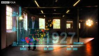
Watch how Rosling walks inside an augmented-reality bubble chart as the year counter runs from 1810 to 2009, with cutaways to a close-up of him and an 'action replay' near 4:03 that reruns the whole history.
Class question
How does putting a human presenter inside the chart make two centuries of data easier to follow?
Replaced: The current clip is a fan-made bar-chart race; Hans Rosling's 200 Countries, 200 Years, 4 Minutes is the most famous animated-data film ever made, on the official BBC channel.
Original reference: Our World in Data — animated data visualizations
Watch how bold blue statistics such as '330 million women and girls' at 0:45 appear beside the experts who state them, so every figure is anchored to a speaking face.
Class question
What would the audience lose if these statistics were shown as full-screen graphics with no speaker?
Kept: Same UN Women gender-equality explainer; the official 2:25 clip already demonstrates statistic-to-human-context editing.
06
Mobilization, Fundraising & Campaign CTA
5 references
Technique exercise: watch one clip below twice, once for the story and once counting the cuts. Log three cut points against its "watch for" note, say what each cut does, and propose one alternate cut.
Watch how rapid cuts (about 51 a minute) of patients, surgeons and symbolic opponents such as 'Worry', 'Infant Mortality' and 'Time' build like a fight-film trailer to the neon 'VS' card at 1:18 and the logo at 1:58.
Class question
How does cutting a children's hospital appeal like a boxing trailer change the emotion a donor is asked to feel?
Replaced: UNICEF's education spot is not a widely known appeal; SickKids VS: Undeniable is the most-cited hospital fundraising film of recent years, recasting donation as a fight, on the foundation's own channel.
Original reference: UNICEF — emergency appeal campaign films
Watch how a slow, mournful cover of 'Everything Is Awesome' plays over a LEGO Arctic as oil rises shot by shot, ending on a single sinking flag and the 'Tell LEGO' call to action from about 1:36.
Class question
Why does turning a cheerful pop song into a lament make the call to action feel urgent rather than gloomy?
Replaced: 'Greenpeace: Inspiring Action' is a generic channel reel; LEGO: Everything Is NOT Awesome is Greenpeace's most famous mobilisation film and directly drove its petition, on the official channel.
Original reference: Greenpeace — environmental campaign videos
Watch how slow dissolves between caged animals' faces and sparse captions ('Every hour…') hold the viewer before Sarah McLachlan appears at 0:54, after which the phone number stays on screen for the rest of the spot.
Class question
Why does this appeal keep the donation number on screen for a full minute instead of saving it for the end?
Replaced: The current Red Cross volunteer clip is a minor news item; Sarah McLachlan's SPCA appeal is the archetypal (and much-parodied) animal-welfare donation spot, here in its BC SPCA version (no official upload remains).
Original reference: Red Cross — disaster response appeal films
Watch how close-ups of ordinary men are interrupted by black text cards, then the film names its funded projects ('Brothers Through Boxing', 'Men's Pie Club') as on-screen titles from about 0:54.
Class question
How do the named project titles turn a broad cause into something a viewer feels they can join?
Watch how identical black-and-white portraits of famous faces each deliver one finger click on a steady rhythm, before plain white cards at 0:47-0:55 give the campaign name and the website.
Class question
How does repeating the same tiny gesture across many faces turn a statistic into a rhythm the audience can feel?
Replaced: The Global Citizen Accra clip is an event promo; Make Poverty History's 'Click' is the iconic celebrity mobilisation spot in which a snap every three seconds stands for a child's death (no official upload remains).
Original reference: Global Citizen — campaign and advocacy films

 Official upload3:13